

fabrykatarasow.com
ONE PAGE WEB DESIGN
One Page is a website that consists of only one sub-page divided into segments. This is the opposite to “ordinary” website with separate dedicated sub-pages, such as the contact form or the “about us” tab. They are becoming increasingly popular and no one is surprised at all. Undoubtedly, this is not only an interesting and very good looking solution, but also a very useful trend.
Of course, one-page websites are not perfect for every project, but there are many reasons to use them.
Every internet user knows how to scroll through the pages. But you can also provide arrows or other navigation tips. You will never have to worry that a potential customer or ordinary user is stuck somewhere in the dark abyss of your website and will not get what he needs. On one-page page everything is just in one place.
The responsive look is not, of course, only a one page domain. Although the more complex the website is, the harder it is to encode its layout to match mobile devices.
There are restrictions on site construction and the lack of opportunities for content marketing. We will have to significantly reduce the number of keywords and put more emphasis on factors other than content writing, which in 2017 is quite important element of SEO/SEM.
It really depends on what kind of tasks website has to fulfill. One-page sites were created mainly for mobile devices like tablet, smartphone).
In the case of company websites, every e-marketing specialist will see it differently. One-page works great for company websites that serve as company business cards (for an example of that kind page, see the last paragraph). Including basic information such as contact information and handing it to a user on one-page will be easier and more effective. Every industry is governed by its laws. Websites designed for them should help, not interfere. Therefore, before we choose how exactly our new website will look, we must conduct an in-depth analysis. Disadvantages and disadvantages of one-page pages you already know. Choice should be a little bit simpler.
Do not decide to ope-page when you need to put more text on the website. No one want to read and scroll all day long.
If you are in love with ope page web design, but you are not sure if it is a good choice, you can always use a hybrid! You can apply a home page as a landing page (with a presentation of the offer and a call to action – action button), while in each section put a button “read more”. The link will direct the separate traditional sub-pages with more information.
The world is moving towards simplicity, and thanks to that, this trend can be observed on the Internet more and more often. In many cases we give up on websites which are as intricate as labyrinths where you can easily get lost. We think that this is a very good solution. Minimalist graphics, delicate fonts, easy navigation are something we could both watch and design almost every day.
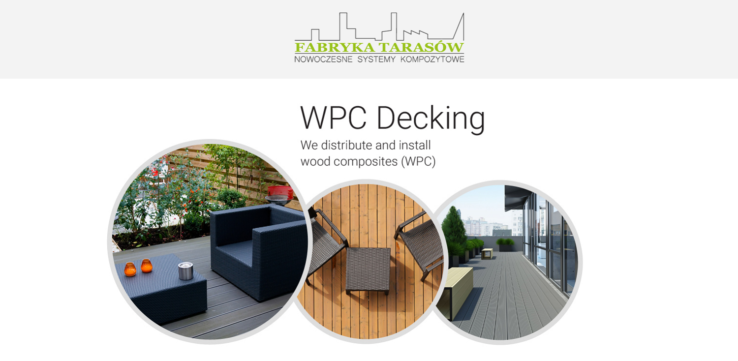
We have made one pages several times. For exapmple a web business card of one of our regular customers. Simple, inexpensive graphics referring to the online store that leads our customer. The main task of this site is of course generating queries from English-speaking users.

 305-600-2778

 1150 Nw 72nd Av T1 Ste 455 #5377, Miami, FL 33126